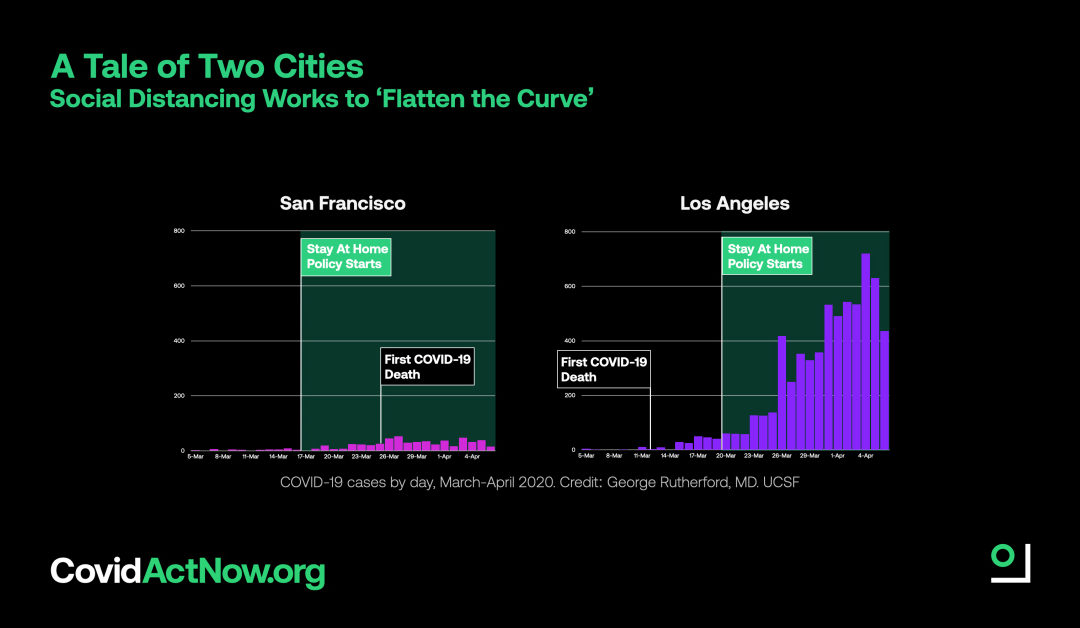
If you want to really know the benefits of social distancing, look at this amazing graphic and story from COVIDACTNOW.ORG.
Dr. George Rutherford from UCSF pointed us to this data visualization which illustrates how COVID-19 caseload has varied between Los Angeles and San Francisco. It maps when each city implemented Stay At Home policies relative to when each city experienced its first COVID-19 death.

